Larger customer and food ticket fonts!
Recently, I wrote a blog on customer receipts. The focus was that a number of the receipts out there are not very attractive looking.
After that blog post, I had some emails asking about a larger font on either a kitchen / barista ticket or on the customer ticket itself.
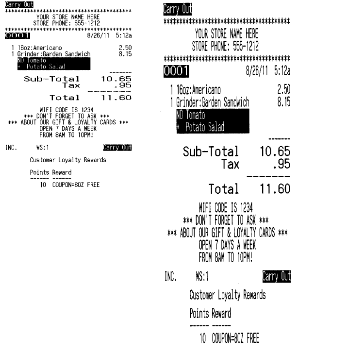
My support and development department looked into this and came up with a way to do it for our customers. The image on the left is the standard font and size that we typically print.
The image on the right is an example of a larger font.
