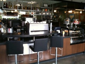
Coffee Shop Design
Today we have a guest post from one of our friends in the industry. Ed Viser has worked with a number of our customers on design issues. He has always had great insights on what to look for when designing a coffee shop or restaurant and has allowed us to include some of his thoughts in this blog!
From Ed Viser– Principal Designer – Cafe Design & Architecture:
Recently, I had been asked by Specialty Coffee Retailer Magazine to provide some insight on coffee shop design and construction. Their primary reason for asking me I feel was to create a “Do-it-yourself” guide for the retailer on design and construction of coffee houses. They asked me for a rule of thumb on constriction costs etc…There really is no rule-of-thumb for the amount of money you can spend on the design & construction of your shop. Specialty coffee houses can be beautiful with a minimalist design or sport lavish décor. The key is to identify your front-of-house concept considering demographics, style, location and your budget. You might also visit other restaurants and cafés and see what works, what doesn’t work and develop or add to your personal ideas & style.
For service line ergonomic layout, some owners will do minimal coffee bars with espresso & drip or pour-over coffee; others go as far as adding beer and wine to the menu. It should be obvious, (but for first timers it usually is not), that the more you increase your menu offerings, the more expensive the equipment, infrastructure, design & construction budget will have to be. So in order to keep a lower budget, get your menu refined and then start planning.
Don’t trade experienced ergonomic design for a layout done by a part-time consultant or a local equipment dealer to cut costs! This superficial savings will cost you money down the road when you realize that your baristas lack of functionality is due to improper ergonomics, and also results in longer wait times for customers. Another consideration for economizing your design when purchasing equipment, you can most likely find like-new, (but used) equipment for a fraction of the cost of a new piece.
Speaking of functionality and ergonomics, every location has its ups and down of flow, exposure, storefront, traffic, etc. So while planning your shop, always consult a professional. A good professional will help you with site selection, location orientation, approach, signage and general visibility issues.
Louis Sullivan, a well-known architect from the Modernist Movement, said, “Form follows function”. This is especially true when you have a few dozen pieces of under-counter, and counter top equipment to plan for ergonomically. You don’t want to create overlaps in worker circulation behind your service line, nor do you want equipment to be obstructive to the patron’s experience.
In our experience aesthetically, you want to maximize your front of house exposure with good lighting and a non-cluttered setting. Good flow that is obvious is always helpful. Don’t mix styles of casual furniture; this may have been fine in the old coffee shop days like “Congo Square” inSanta Monica, when eclectic was not a bad word. Today’s specialty coffee bar requires more sophistication aesthetically. If you insist on going at it alone, you can always get good ideas from what’s around you. But in order to not make the same mistakes they made, do more research and call for a consultation from a professional designer (not to be confused with a decorator).
Ed’s contact information:
Ed T. Viser, CID
Design Principal
C 925.216.1782
ncidq certification #8672
ccidc certification #5786
877.223.3707 x511
eFax: 707.361.0953

